The story
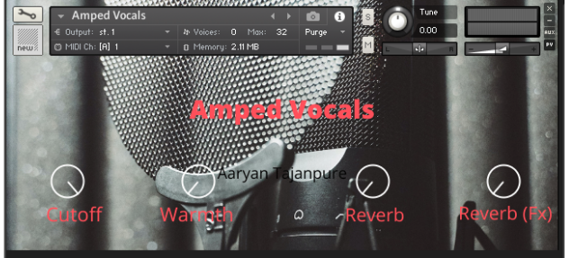
I always wanted to find interesting ways of creating mesmerizing textures using vocals. That’s when I asked myself the question ‘what if I run them through amp sims?’. After hours of tuning and effect processing, this is the result. I have tried to have a go at Kontakt scripting and created 4 knobs, cutoff, warmth, reverb, and reverb fx to take into note the honest and amazing reviews on my previous sample instruments, and I went through to sample 3 round robins for shorts. Hope you enjoy it!
Interface

Reviews for Amped Vocals
- Sound
- Character
- Playability
- Inspiration
- GUI
Leave a review to let others know what you thought of the instrument!
Absolutely Crazyily amazing
This is one of the most craziest find i have found on Pianobook. So so cool. The vocal driven texture is just mind boggling to my hears. Love it soo much. Has a kind of Dune-ish texture to it. Could see it playing behind in that film scape
Authentic sounding
I really like that it sounds like a real voice, tethering on the edge of breaking, while sung through the amp. It definitely inspires a certain type of writing to be used with.
The knobs are a bit weird, in that they are turned horizontally instead of the typical vertical movement
F5 seems to have a knock at the start of the note, which sounds great but makes it inconsistent with the rest of notes.
Electrifying!
This reminds me of how Michael Winslow sounds when he does electric guitar solos with his voice! If you don't know what I'm saying, this is a heavily processed vocal lines that sound like a distorted electric guitar. These are some sounds that you won't easily find anywhere so it's definitely worth checking out.
As a downside, the sounds are either mostly panned to the right or to the left, which may seem a little weird at first but nothing dealbreaking. The reverbs do a good job, but be careful because they can dramatically increase the loudness.
The GUI is alright, I guess it could use a different font and a darkened background, so everything is much clearer.


